Few sports organizations in America carry as much legacy, pride, and competitive fire as USA Track & Field. And the USATF logo — with its bold patriotic colors, dynamic wings, and powerful wordmark — is a visual testament to everything the organization stands for: speed, strength, and the pursuit of gold.
A Governing Body with Deep Roots
USA Track & Field (USATF) is the United States national governing body for the sports of track and field, cross country running, road running, and racewalking — known collectively as the sport of athletics outside the US.
The organization’s history stretches back well over a century. Founded in 1979 as The Athletics Congress (TAC) to succeed the Amateur Athletic Union in governing the sport, USATF adopted its current name in 1992 — a rebranding designed to increase public recognition and better reflect the organization’s national identity.
Based in Indianapolis, USATF is a non-profit organization with a membership of more than 130,000, making it one of the largest and most active sports governing bodies in the United States.
What USATF Does
USATF encompasses the world’s oldest organized sports, the most-watched events of Olympic broadcasts, the number one high school and junior high school participatory sport, and more than 30 million adult runners in the United States.
The organization provides rules, officials, coaching education, sports science and athlete development, youth programs, masters competition, and the National Track and Field Hall of Fame. It also organizes the USA Track and Field Outdoor Championships, the USA Track & Field Indoor Championships, the USA Cross Country Championships, and several other national-level competitions.
At the international level, USATF is the IAAF member federation in the United States and a member of the United States Olympic Committee, selecting teams for Olympic and Pan American Games competitions through the Olympic Trials.
Breaking Down the USATF Logo
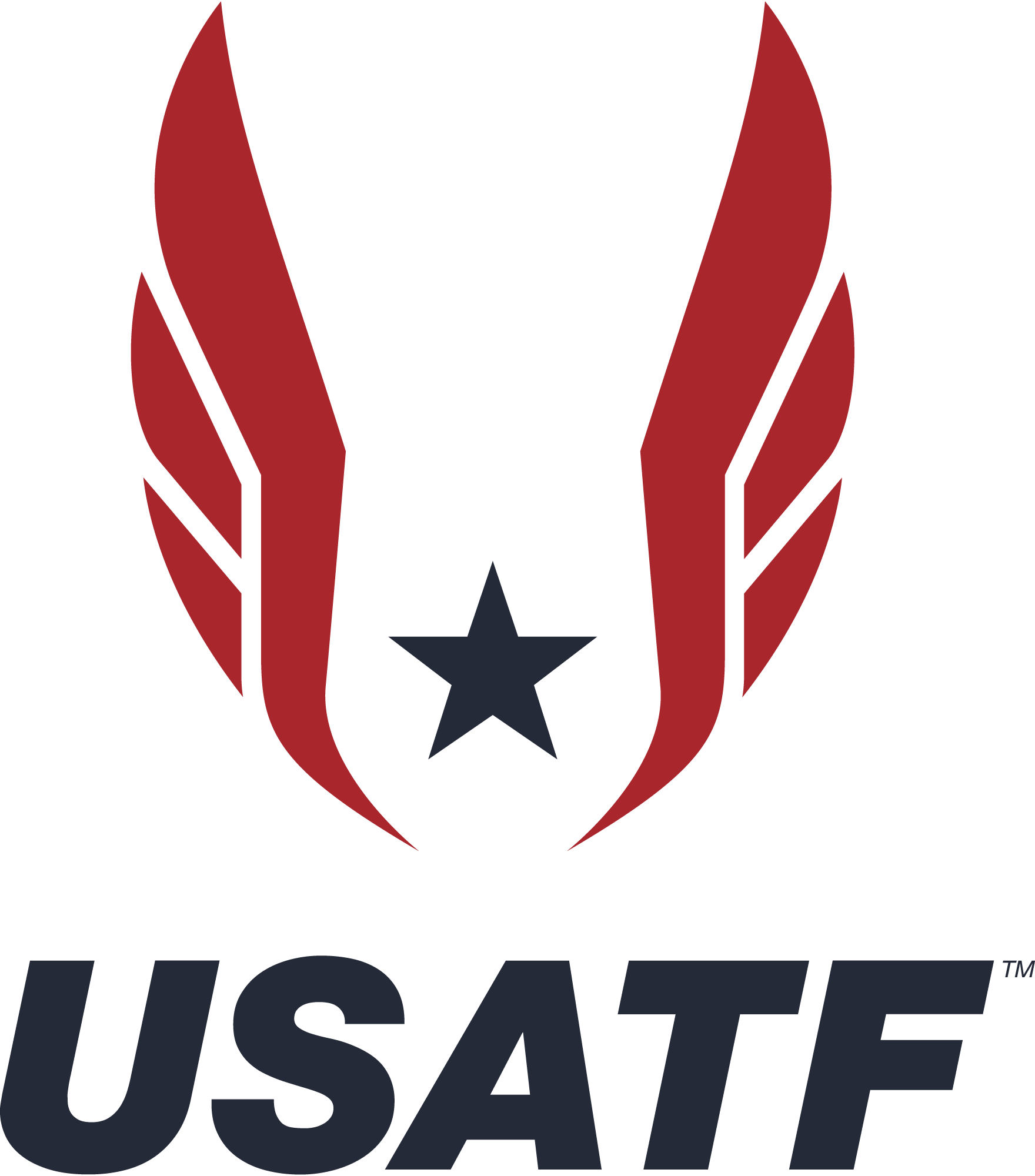
The USATF logo is a masterclass in sports branding — every element earns its place and communicates something meaningful.
Central to the logo is the prominent text “USA” in a strong blue font, conveying patriotism. Below “USA,” the words “TRACK & FIELD” appear in a contrasting red font, emphasizing the sport’s focus. Flanking the text are two stylized wing shapes rendered in vibrant red, which add a sense of movement and energy while symbolizing speed and athleticism. Between the wings sits a star in blue, further reinforcing the national theme. The overall color palette of red, blue, and white reflects the American flag.
Together, these elements create a logo that feels both athletic and distinctly American — dynamic enough to appear on a stadium scoreboard or a sprinter’s jersey, yet structured enough to represent an official governing body on the world stage.
The Wings: Speed, Power, and Flight
The wing motif in the USATF logo is perhaps its most expressive element. Wings have been a symbol of athletic achievement since ancient Greece — Mercury’s winged feet, the iconic winged foot of the New York Athletic Club — and USATF’s logo taps directly into that tradition. For a sport built on human speed, the symbolism couldn’t be more fitting.
The wings also communicate aspiration. Track and field is, at its core, about pushing beyond limits — running faster, jumping higher, throwing farther. The outstretched wings in the logo capture that spirit of perpetual forward motion.
A Brand Built for the Olympic Stage
USATF approached JTA Design to develop a visual identity for its “Journey to Gold” campaign, with the goal of creating a brand that gets fans genuinely able to stand with Team USATF at every step of their journey, feel the pride of USATF’s dominance in the sport, and support the US Track and Field community. The campaign features across all major Track and Field events in the USA and on TV during the Olympic Games.
This campaign-level branding reinforces what the core USATF logo already communicates: this is an organization that competes — and wins — at the highest level.
A Legacy of Champions
The logo represents an extraordinary athletic legacy. Athletes affiliated with USATF have secured dominant success in global track and field, amassing the most Olympic and World Championships medals of any national federation across the sport’s history.
At the 2016 Olympics, USATF achieved its highest medal count since 1936, winning 32 medals, and went on to its most-ever medals at a World Championships, winning 30 at the 2017 IAAF World Championships. When fans see the USATF logo on a bib, a jersey, or a banner, they know they’re watching the best in the world.
Why the Logo Works
The USATF logo succeeds because it balances two things that are often hard to achieve simultaneously: authority and energy. The bold typography and structured layout give it the gravitas of an official governing body. The wings, the star, and the red-white-and-blue palette inject it with the athletic fire that track and field demands.
It doesn’t try to be clever or abstract. It stands tall, plants its feet, and declares exactly what it is — the home of American athletics excellence.