The PAW Patrol logo is the colorful and playful emblem of the popular children’s animated television series PAW Patrol, a globally loved franchise that first premiered in 2013. Created by Keith Chapman and produced by Spin Master, the show follows a team of heroic rescue pups led by a boy named Ryder who work together to help their community.
The logo captures the spirit of the series perfectly. With its bright colors, playful typography, and distinctive paw-themed imagery, the emblem instantly communicates the show’s themes of teamwork, bravery, and helping others. It is designed to appeal primarily to children, combining bold shapes and vibrant tones that make it easy to recognize on television screens, toys, clothing, and digital media.
Over time, the PAW Patrol logo has become more than just a television title card—it’s now a global brand symbol appearing on toys, games, merchandise, and entertainment experiences worldwide.
Logo History
The PAW Patrol logo has remained largely consistent since the series debuted, but it evolved during the early development phase.
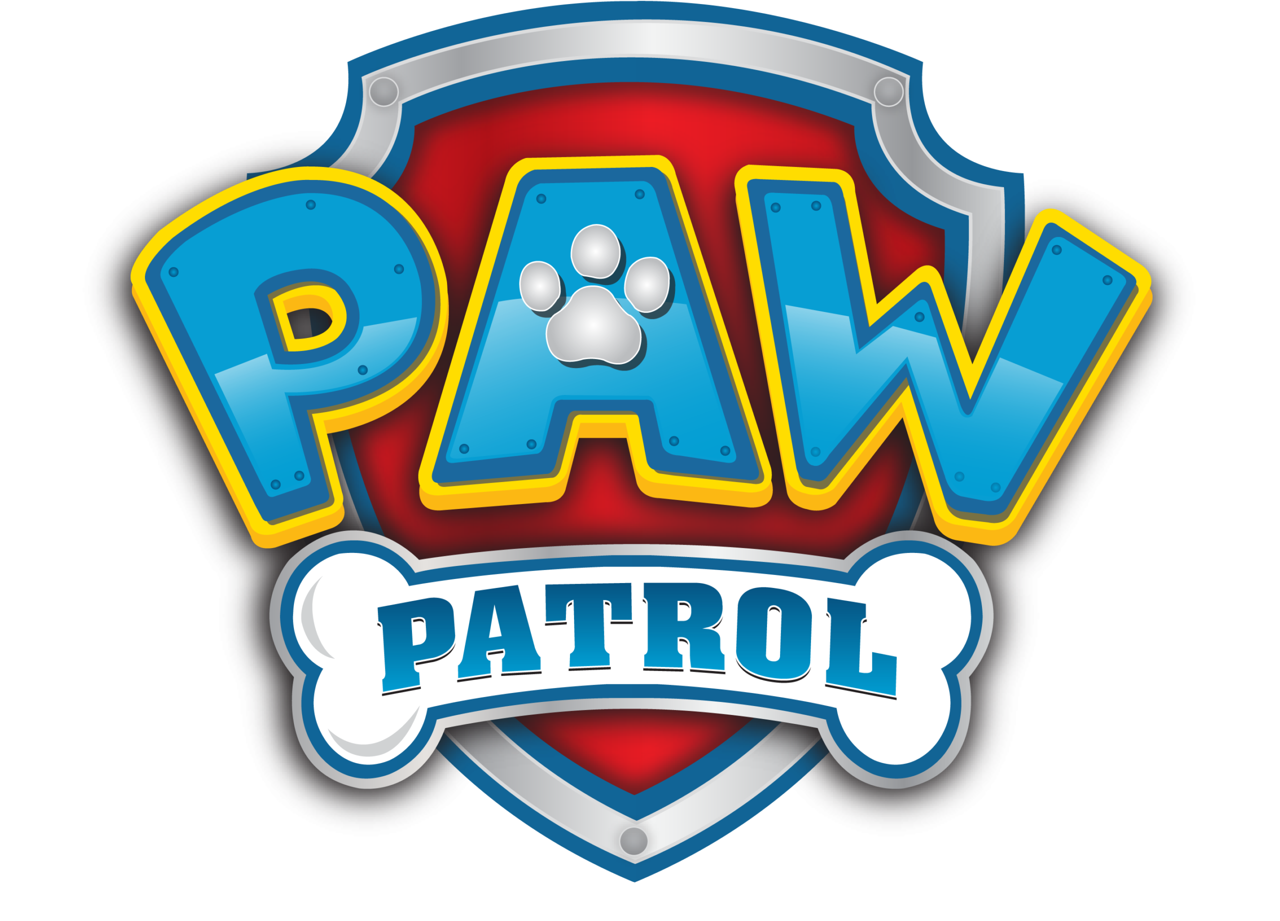
2012–2013: Early Concept
The first concept version of the logo featured a shield-like badge with the title placed across it. The word “PAW” appeared prominently at the top, while “Patrol” was written on a bone-shaped plate below, emphasizing the canine theme of the show.
2013–Present: Final Logo
When the series officially launched in 2013, designers refined the emblem into the version now recognized around the world. The shield became brighter and more polished, and the lettering gained stronger outlines and 3-D styling.
Since then, the logo has stayed mostly unchanged, though localized versions sometimes appear in other languages when the show airs internationally.
This consistency has helped the brand maintain strong recognition among young audiences across multiple countries.
Design Meaning and Symbolism
The PAW Patrol logo combines several design elements that represent the show’s core themes.
Paw Print Symbol
The paw print integrated into the lettering highlights the central characters—rescue dogs working together to protect their community. It symbolizes teamwork, loyalty, and the bond between humans and animals.
Shield Shape
The shield-like badge behind the text resembles a rescue or police emblem, reinforcing the idea that the pups act as heroes who help keep their town safe.
Bone-Shaped Banner
The word “Patrol” is displayed on a white bone graphic beneath the main title. This playful detail references classic dog imagery while reinforcing the canine theme of the show.
Friendly Typography
The bold, rounded letters are designed to feel energetic and approachable, making them easy for children to read and remember.
Together, these elements create a logo that is fun, recognizable, and perfectly aligned with the show’s adventurous storytelling.
Color Philosophy
The PAW Patrol logo uses a bright and energetic color palette that appeals to young viewers.
Blue
Blue is the dominant color of the title lettering and represents trust, reliability, and teamwork, all key themes of the show.
Red
The red shield background adds excitement and energy, making the logo visually striking and dynamic.
Yellow
Yellow outlines and highlights bring warmth and positivity, reinforcing the playful nature of the series.
Silver and White
Metallic silver edges and the white bone banner create contrast and give the logo a polished, three-dimensional look.
The result is a vibrant color scheme that stands out on screens, merchandise, and promotional materials.
Cultural Impact
Since its debut, PAW Patrol has grown into one of the most successful children’s entertainment franchises in the world. The series’ popularity quickly expanded into toys, games, clothing, and films.
The merchandise line launched in 2014 and rapidly became a major commercial success, generating hundreds of millions of dollars in sales within the first few years.
Because of this global popularity, the PAW Patrol logo is now recognized by millions of children and parents worldwide. Whether on lunchboxes, backpacks, or animated episodes, the emblem has become a symbol of fun adventures, friendship, and heroic teamwork.
FAQs
What is the PAW Patrol logo?
The PAW Patrol logo is the official emblem of the animated children’s series PAW Patrol, featuring a paw-themed title design inside a shield-shaped badge.
When was the PAW Patrol logo created?
The modern version of the logo was introduced in 2013, when the television series first premiered.
What does the paw print symbolize?
The paw print represents the team of rescue puppies who help protect their community and assist people in need.
Why is there a bone in the logo?
The bone beneath the title references the canine theme of the show and adds a playful, kid-friendly element to the design.
Who created PAW Patrol?
The show was created by Keith Chapman and produced by Spin Master.