The Parramatta Eels are one of Australia’s most famous rugby league clubs, competing at the highest level in the National Rugby League (NRL). The club represents western Sydney, New South Wales, and has been an integral part of Australia’s rugby league landscape since 1947, when it was admitted into the premier competition — then the New South Wales Rugby Football League (NSWRFL).
Today the Eels have a passionate supporter base, a distinct visual identity, and one of the most recognisable brands in Australian sport — built on history, community, culture, and a strong visual language centred on its iconic logo and colours.
1. Brand Overview
Established as a club without a nickname or mascot, Parramatta was initially informally known as the “Fruitpickers” — reflecting the orchards that once dominated the local area. In the mid‑1960s, rugby league journalist Peter Frilingos proposed that the team be called the “Eels”, inspired by the Aboriginal‑derived name Barramattagal meaning place where eels dwell — a reference to the nearby Parramatta River. By the late 1970s, the Eels identity became official and has remained central ever since.
Parramatta is known for its royal blue and gold colours — representing both club identity and unity — and has enjoyed notable success, particularly in the 1980s, when it won four premierships.
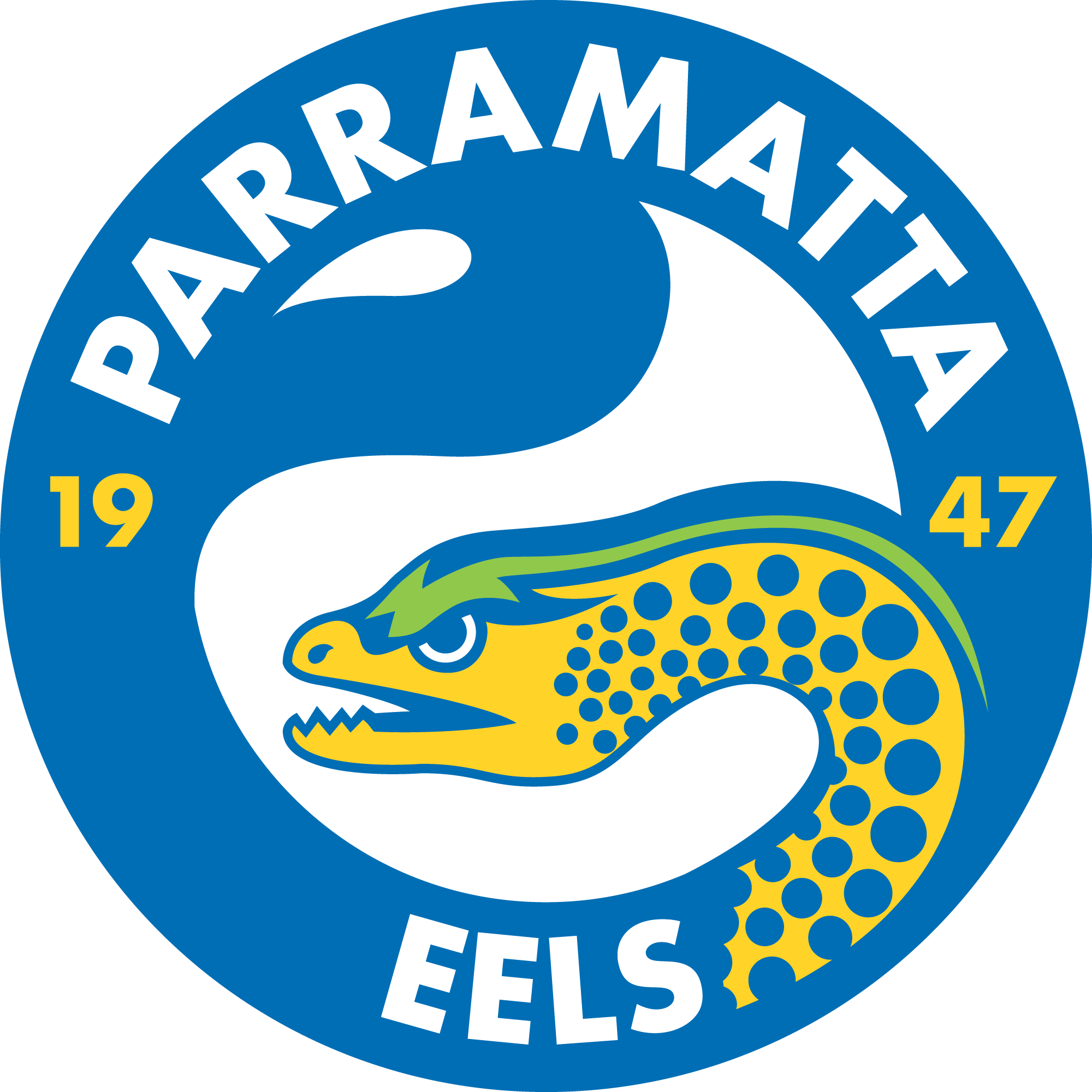
2. Logo History
Across its history, the Parramatta Eels logo has evolved alongside the club’s journey, reflecting changes in visual branding aesthetics and club identity:
Early Crest (1960s–1970s)
Before the Eels identity was adopted, the club used logos based on the Parramatta City crest, illustrating a traditional foreshore scene along the Parramatta River — acknowledging local history and heritage. These early marks were detailed and symbolic but proved less suited to commercial and sporting branding.
1979 – 1999: The First Eel Logo
In 1979, the club introduced its first true eel‑based emblem. This logo featured a more aggressive eel head — often housed within a circular design — and incorporated the team’s blue and gold colours. This version became strongly associated with the Eels’ rise in competitiveness and popularity throughout the 1980s.
2000 – 2003: Modernised Era
With the turn of the century, Parramatta updated its crest to align with modern trademark and branding standards, bringing a sleeker eel mark and updated typographic treatments.
2004 – Present: Classic Re‑interpretation
In 2004, the club revisited the traditional eel icon with a design more reminiscent of the earlier logo — simpler, bolder, and centred on a stylised eel silhouette. In 2011, Parramatta added “1947” to the logo to commemorate its founding year and reinforce heritage.
Today’s logo balances modern visual appeal with a continued connection to club history — using bold form and clear typography to anchor the Parramatta brand.
3. Design Meaning
Eel Motif
The eel itself is central to the club’s visual identity and reflects both the nickname and local heritage. It serves as a metaphor for:
- Resilience and agility — traits valued in rugby league performance.
- Connection to place — the Parramatta River ecosystem and its cultural significance.
- Distinctiveness — setting the team apart in the NRL through a unique creature as a mascot and emblem.
Typography & Layout
The club name Parramatta Eels is typically placed prominently around or beneath the eel symbol, often in bold, uppercase type. This ensures readability in merchandising, stadium signage, and digital contexts while tying the symbol directly to the team identity.
4. Color Philosophy
The Parramatta Eels’ colour palette is one of the most enduring in the NRL:
- Royal Blue: Represents depth, loyalty, and strength — and has long been associated with the club’s on‑field attire.
- Gold: Adds contrast and energy, symbolising excellence, achievement, and brightness against the deep blue.
These colours are used consistently across logos, jerseys, merchandise, and branding elements, helping maintain visual cohesion and a recognisable brand presence in all contexts.
5. Cultural & Community Identity
The Club’s identity extends beyond sport into community and cultural engagement:
- Parramatta’s logo and name honour not just sporting heritage but also Indigenous history — particularly the Burramattagal people whose connection to the Parramatta River predates colonial history by thousands of years. This cultural significance has been recently reinforced through Indigenous jersey designs and storytelling in club apparel.
- Special heritage initiatives, like anniversary logos (e.g., the 70th anniversary logo used in the 2017 season), celebrate the club’s history while honouring supporters and contributors across generations.
6. FAQs
Q: What does the Parramatta Eels logo represent?
A: It symbolises the club’s nickname, heritage, and connection to the Parramatta River — with the eel motif representing resilience and local identity.
Q: When was the Eels nickname adopted?
A: The nickname became official in the late 1970s, after local media popularised the idea based on Aboriginal language roots and local history.
Q: Why are blue and gold the club colours?
A: The royal blue and gold palette reflects club tradition, visibility, and a strong visual presence that has endured across decades of branding and uniforms.
Q: Has the logo changed over time?
A: Yes — from early town crest-based marks to the distinctive eel emblem introduced in the 1970s, through modern updates and heritage nods, the logo has evolved while retaining its core identity.