Build‑A‑Bear Workshop Brand Overview
Build-A-Bear Workshop is an American experiential retail company founded in 1997, headquartered in St. Louis, Missouri. It pioneered a unique interactive shopping experience where customers of all ages create and customize their own stuffed animals — choosing the animal, stuffing it, adding sounds/scents, dressing it, and naming it — making it more than just a toy purchase but an emotional keepsake.
The brand is built around creativity, personalization, emotional connection, and fun. Over the years it has expanded globally with hundreds of locations in countries across North America, Europe, Asia, and beyond, and has developed partnerships with major entertainment brands to broaden its toy lineup.
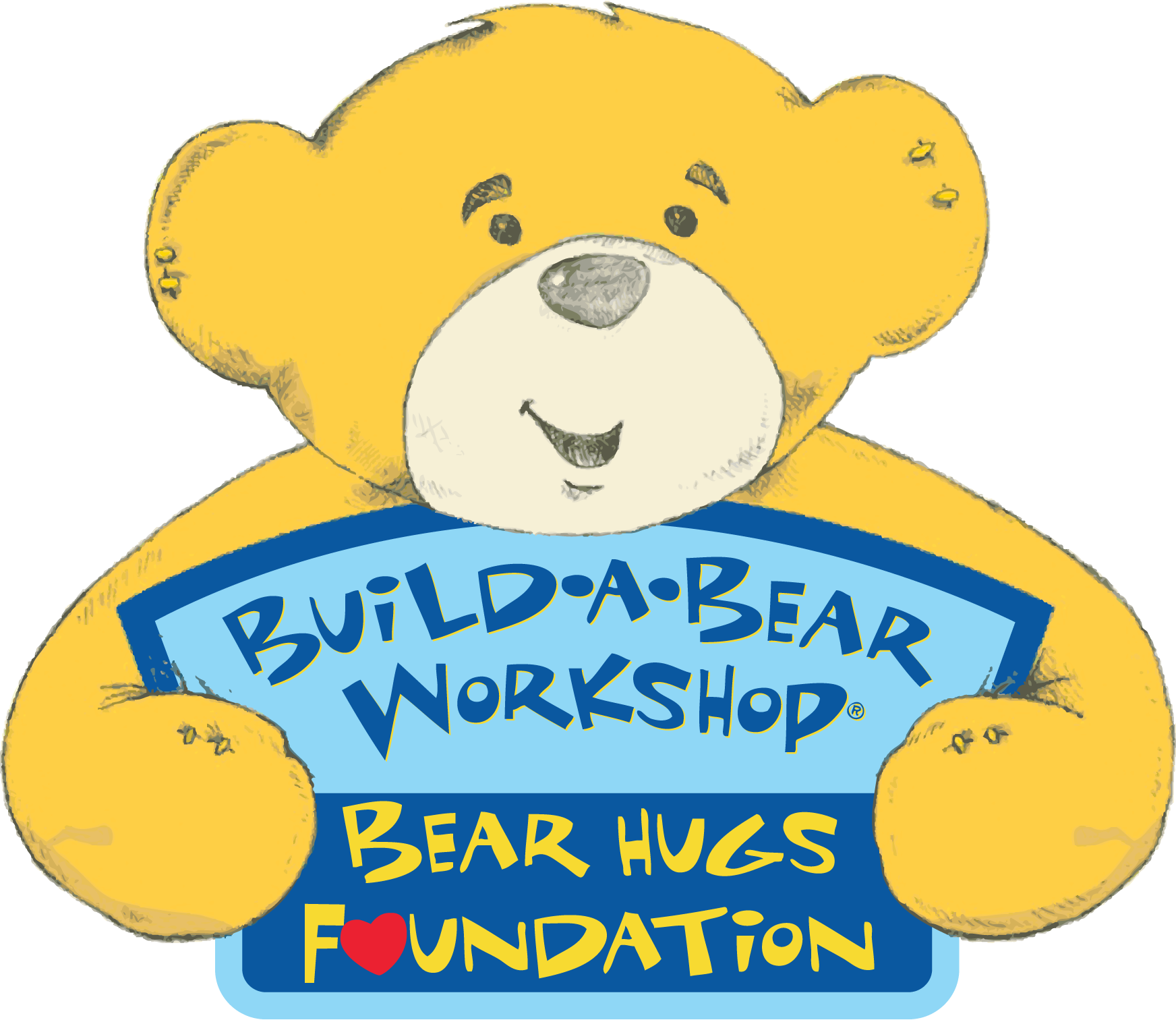
Logo History
The Build-A-Bear Workshop logo has evolved significantly since the company’s early days:
- 1997–2013: The original logo was a detailed circular emblem featuring multiple bear characters engaged in sewing activities with playful hand-drawn typography, representing the craft and interactive nature of the brand.
- 2013–2015: The logo was simplified into a cleaner emblem with fewer characters, more vibrant contrast, and a clearer message of friendly fun.
- 2015–present: The current logo design focuses on a stylized bear head and bold text with playful, multicolored patch-style lettering. This modern look maintains the essence of craftsmanship and joy while being digitally friendly and legible across platforms.
Design Meaning
The Build-A-Bear Workshop logo embodies the brand’s core values of creativity, personalization, and emotional connection:
- Bear Symbol: The stylized bear head represents the heart of the brand — the furry friend customers create and connect with. The bear communicates warmth, safety, and companionship.
- Playful Typography: Lettering with decorative elements or patch-like patterns is designed to resemble sewn fabric and craft materials, alluding directly to the workshop experience.
- Overall Shape: The logo’s friendly curves and balanced composition reflect fun, approachability, and a child-centric spirit that also resonates with nostalgic adults.
Color Philosophy
Build-A-Bear Workshop uses a bright, vibrant color palette that reinforces its playful and joyful identity:
- Primary Colors: Warm tones like yellow, red, and blue form the core of the visual identity, capturing energy, friendliness, and positive emotion.
- Accent Colors: Additional hues such as green and orange may appear in the logo and decorative lettering, reflecting variety, imagination, and customization — key elements of the brand experience.
- Contrast & Visibility: The palette is chosen to be eye-catching and legible in both physical signage and digital formats, appealing to children, families, and multi-generational audiences.
Usage Guide
To maintain brand consistency and protect identity when using the Build-A-Bear Workshop logo:
Clear Space:
- Always preserve sufficient space around the logo so it is not crowded by other elements.
Scaling & Format:
- Resize the logo proportionally; avoid stretching or distortion.
- Use vector formats (SVG/EPS) for print and high-resolution PNG with transparent background for web/digital use.
Color Application:
- Use official brand colors only. Avoid recoloring or adding unapproved gradients, shadows, or visual effects.
Backgrounds:
- Place on clean, high-contrast backgrounds to ensure visibility and clarity.
Prohibited Uses:
- Do not rotate, crop, or modify the logo.
- Do not combine it with other marks in a way that dilutes the brand identity.
FAQs
1. What does the Build-A-Bear Workshop logo represent?
It symbolizes creativity, personalization, and the emotional experience of creating a custom stuffed animal friend.
2. Can I use the logo for my project?
Logo use generally requires permission from Build-A-Bear Workshop, especially for commercial purposes. For editorial or informational use, ensure proper context and credit.
3. Are modifications allowed?
No. The logo must remain in its original form with no changes to design elements, colors, or proportions.
4. Which formats should I use?
Use SVG or EPS for scalable print applications and PNG for digital platforms.
5. How should I place the logo on backgrounds?
Use clean, uncluttered backgrounds with strong contrast to enhance readability and visual impact.